Summary
The IRIS DMC's Event Plot product is a suite of plots that are automatically generated following all earthquakes of magnitude 6 or greater. The plot suite uses all open broadband data, or a sub-selection, available at the IRIS DMC at the time the product was generated. Based on data availability and signal quality, some plots may not be produced for certain events.
Quicklinks
Description
Plot categories:
- Station maps
- Global body wave record sections
- Phase aligned record sections
- USArray body & surface wave record sections
- Virtual array P-waves & vespagrams
- Global body wave envelope stacks
- P-wave coda stacks
The category descriptions below contain detailed information regarding how each plot type is generated.
Station maps
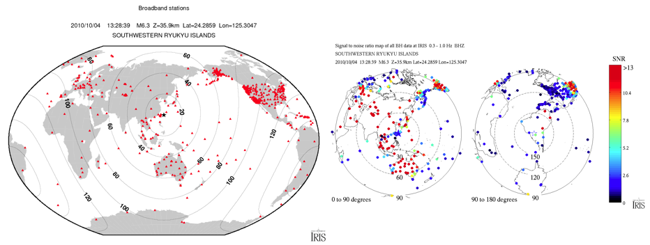
Left: Winkel Tripel projection station map of all broadband data available at IRIS for this earthquake.
Right: Orthographic projection station map showing a simple measure of the signal to noise (SNR) ratio of P (0-100°), Pdiff (100-115°) or PKPdf (115-180°). How best to calculate SNR is subjective, but these plots can provide a good first order look at signal quality issues. The orthographic projection preserves distance and azimuth.
Global body wave record sections & Phase aligned record sections
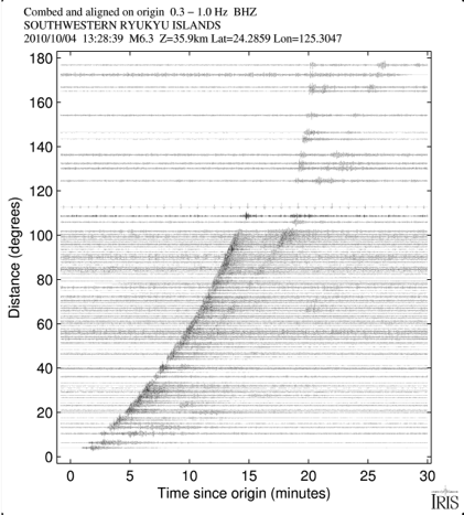
Body wave record sections are 'combed' to show the most even distribution of stations that meet a minimum signal to noise ratio critera. Record sections that are not combed will have solid black regions at distances where many stations exist e.g. USArray. Record sections are either aligned on the origin or specific phases (first P-wave, S, SKS) and produced using three data sets: all broadband data available at IRIS, the GSN, and USArray Transportable Array. Each record section is followed by a version that has overlaying travel time curves of major phases. All figures plot velocity seismograms which have had the instrument response removed. The plots aligned on S and SKS plot displacement.
USArray body & surface wave record sections
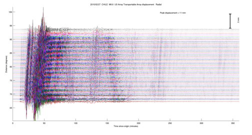
USArray body wave record sections are described above.
Surface wave record sections using USArray LH data are combed and filtered between 20-125 sec. The length of the record section varies based on the event magnitude and all three components (vertical, radial, tangential) share the same amplitude scaling. The instrument response has been removed and the figures plot displacement.

These enhanced USArray LH surface wave record sections plot the same stations as the wiggle record record sections, except they plot amplitudes with a very nonlinear colorscale in order to more evenly highlight late arriving features that are weak, but still coherent. These plots are excellent for viewing multiple orbit surface waves. The scaling is achieved by iteratively raising all of the amplitudes to the power 0.9 until the ratio of the 99th percentile amplitude to the 50th percentile amplitude (the median) is less than 3. This scaling also prevents the colorscale from being driven by a single trace with a problem such as a gap or spike. Enhanced record sections are made for vertical, radial and tangential components and a fourth plot which shows the ratio of the vertical to horizontal power.
Virtual array P-waves & vespagrams
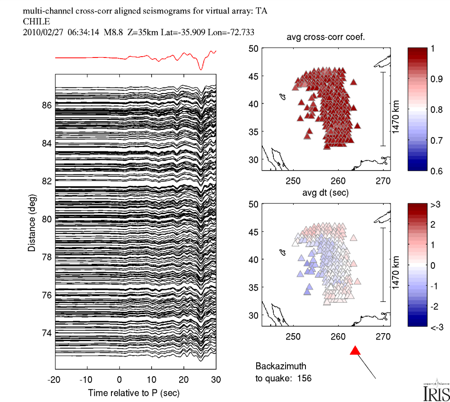
First arriving P-waves (P,Pdiff or PKPdf) from various virtual regional arrays (formed from all available data within a region) are aligned using multi-channel cross correlation (MCCC, VanDecar and Crosson, 1990) where all traces are compared with all other traces. The traces are plotted on the left panel and the stack of all traces is the red trace. Dissimilar traces whose average cross correlation coefficient (CCC) with all other traces is below 0.6 are discarded. Because some stations are discarded, the remaining average travel time shifts (dt) may not have a zero mean. The two maps to the right show the average dt and CCC for each station. The time shifts and CCCs are available as ascii files to download at the bottom of each Event Plot page under 'attachments'. These figures also show the average backazimuth from the stations used. Virtual arrays:
TA = central US, mostly USArray TA
CA = California and Southwestern US
AK = AK and AV networks in Alaska
AU = Australia
EU = central/western Europe
UW = Pacific Northwest
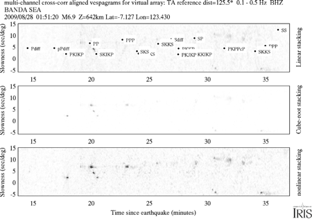
Vespagrams are created for each regional virtual array using the same MCCC shifted traces plotted in the previous figure. The reference distance used is the mean of all the source-receiver distances. The vespagram in the top panel is formed by linearly stacking the data. Major phase slowness and travel times are shown. Some of the virtual regional array apertures span up to ~1500 km in order to maximize the number of traces. This can have the effect of smearing in the Slowness/y-axis direction. Shallow or long duration earthquakes with extended coda tend to smear phases in the Time/x-axis direction. The middle panel shows the same as the top, except cube-root stacking is used to enhance coherent, but sometimes weak, arrivals. The lower panel also plots a cube-root vespagram, but uses a nonlinear color scale unique to each vespagram such that features with amplitudes in the 99th percentile and in the 50th percentile (median) are visible. This is helpful for vepagrams using data which have a very impulsive and large first P arrival that can otherwise dominate the image.
Global body wave envelope stacks
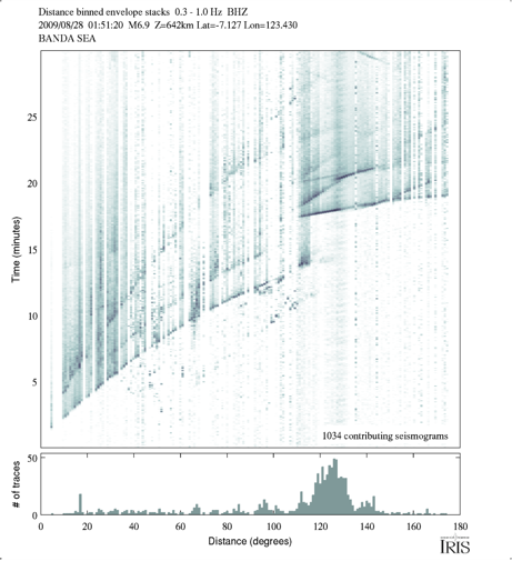
The Global body wave envelope stacks are similar to the plots of Earle and Shearer. All traces are filtered, the envelopes are then calculated and normalized, the pre-P (or Pdiff,PKPdf) noise is removed, and finally the traces are stacked in 1° distance bins. The stacks are nonlinearly weighted by the trace count in order to downweight bins with small trace counts and to more evenly illuminate the latter arrivals.
P-wave coda stacks
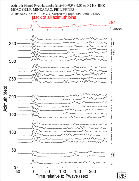
The P-wave coda stacks process data from 30-95° in the same way as the global body wave envelope stacks, except the data are stacked in either azimuth or distance bins and are linearly stacked. For very large earthquakes a cosine(azimuth) pattern can indicate rupture directivity. Coda durations have been shown to correlate with source depth, with shallow events typically having a slower coda decay rate. The red bin-summation trace at the top can indicate characteristics of the event such as whether it was a single impulsive event or a doublet. This distinction can be complicated for shallow events whose depth phases have short lag times.
Citations and DOIs
To cite the IRIS DMC Data Products effort:
- Trabant, C., A. R. Hutko, M. Bahavar, R. Karstens, T. Ahern, and R. Aster (2012), Data Products at the IRIS DMC: Stepping Stones for Research and Other Applications, Seismological Research Letters, 83(5), 846–854, https://doi.org/10.1785/0220120032.
To cite the IRIS DMC Event Plots data product or reference use of its repository:
- IRIS DMC (2011), Data Services Products: EventPlots Maps, record sections & other plots for M6.0+ events, https://doi.org/10.17611/DP/EP.1.
To cite a particular set of Event Plots:
– select the Event Plots of interest
– click on Citations to obtain its DOI
– insert the DOI in below reference:
- IRIS DMC (2011), Data Services Products: EventPlots Maps, record sections & other plots for M6.0+ events, doi:INSERT DOI HERE.
Credits
- Alexander Hutko
Timeline
- 2011-02-01
- Event Plots online


