PIQQA - Data Quality Reports for PASSCAL Experiments

photographer: sevenstar, Public Domain
The IRIS DMC and PASSCAL have teamed up to produce automated quality assurance overview reports for PASSCAL experiments, coming in Spring 2021. Produced by a new Python software tool named PIQQA (PI’s Quick Quality Assessment, pronounced ‘PY-kə’ after the pika, a cute alpine mammal), these reports leverage selected IRIS MUSTANG metrics to provide a broad overview of data availability and noise levels across the experiment. Planned for use in PASSCAL experiment outbriefs, but available by request for any PASSCAL experiment with data archived at the IRIS DMC, these reports are intended to provide Principle Investigators with a visual synopsis of their data quality and links to further explore quality metrics in more detail through MUSTANG web services, as well as to provide PASSCAL staff with data quality feedback to potentially assist in developing future training content. These are not intended to identify all station data problems. In the future, PIQQA will also be made available through GitHub and while the choices of report presentation are designed with PASSCAL experiments in mind, the code is capable of running on any dataset that has MUSTANG metrics available.
A PIQQA report is organized into six sections: availability plots, metric boxplots, Probability Density Function (PDF) plots, spectrogram plots, a station map, and a station list. In the plot sections, separate plots are produced for each requested channel type, e.g., HH? or DP? channels. Current channel types available in MUSTANG include high-gain/low-gain seismometers, accelerometers, gravimeters, geophones, and mass channels (?H?, ?L?, ?N?, ?G?, ?P?, VM?), although not all metrics are run on all channel types.
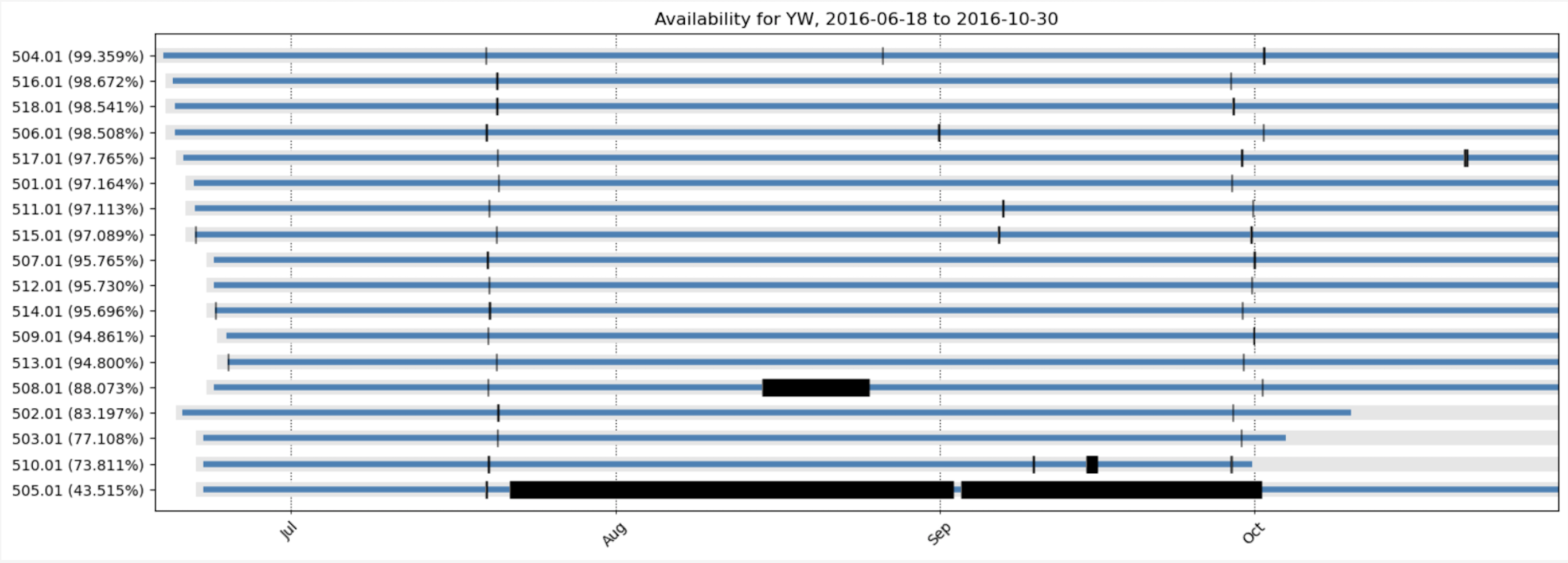
- The availability plots show metadata extents in gray, data extents in blue, and gaps in black (Figure 1). The default gap tolerance used is 60 seconds. In instances where there are more than 30 station-locations, these plots display the top-15 and bottom-15 stations ranked by their total percent availability. Links are included to the fdsnws-availability, ph5ws-availability, fdsnws-station, and/or ph5ws-station web service calls used to create the plot.
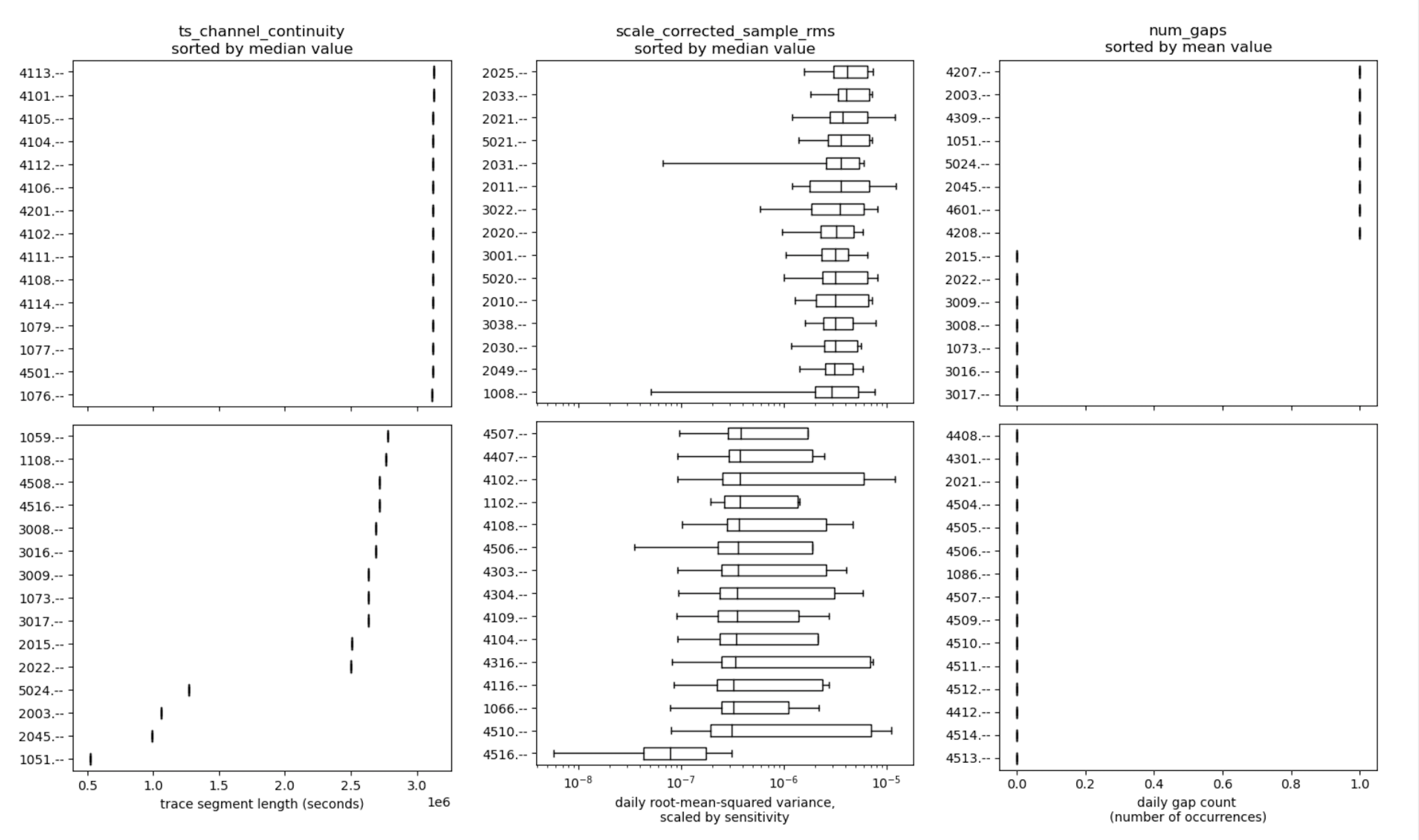
- The boxplot section displays three boxplots for vertical components for the MUSTANG metrics ts_channel_continuity, sample_rms (additionally scaled by the metadata sensitivity), and num_gaps (Figure 2). These plots show the median, first quartile, third quartile, and extents of the metrics excluding outlier values. In instances where there are more than 30 station-locations, these plots display the top-15 and bottom-15 stations ranked by median value for the ts_channel_continuity and sample_rms metrics, and ranked by mean value for the num_gaps metric. Links are included to MUSTANG measurements web service calls used to retrieve the metrics values. Metric choice for the boxplots is customizable.
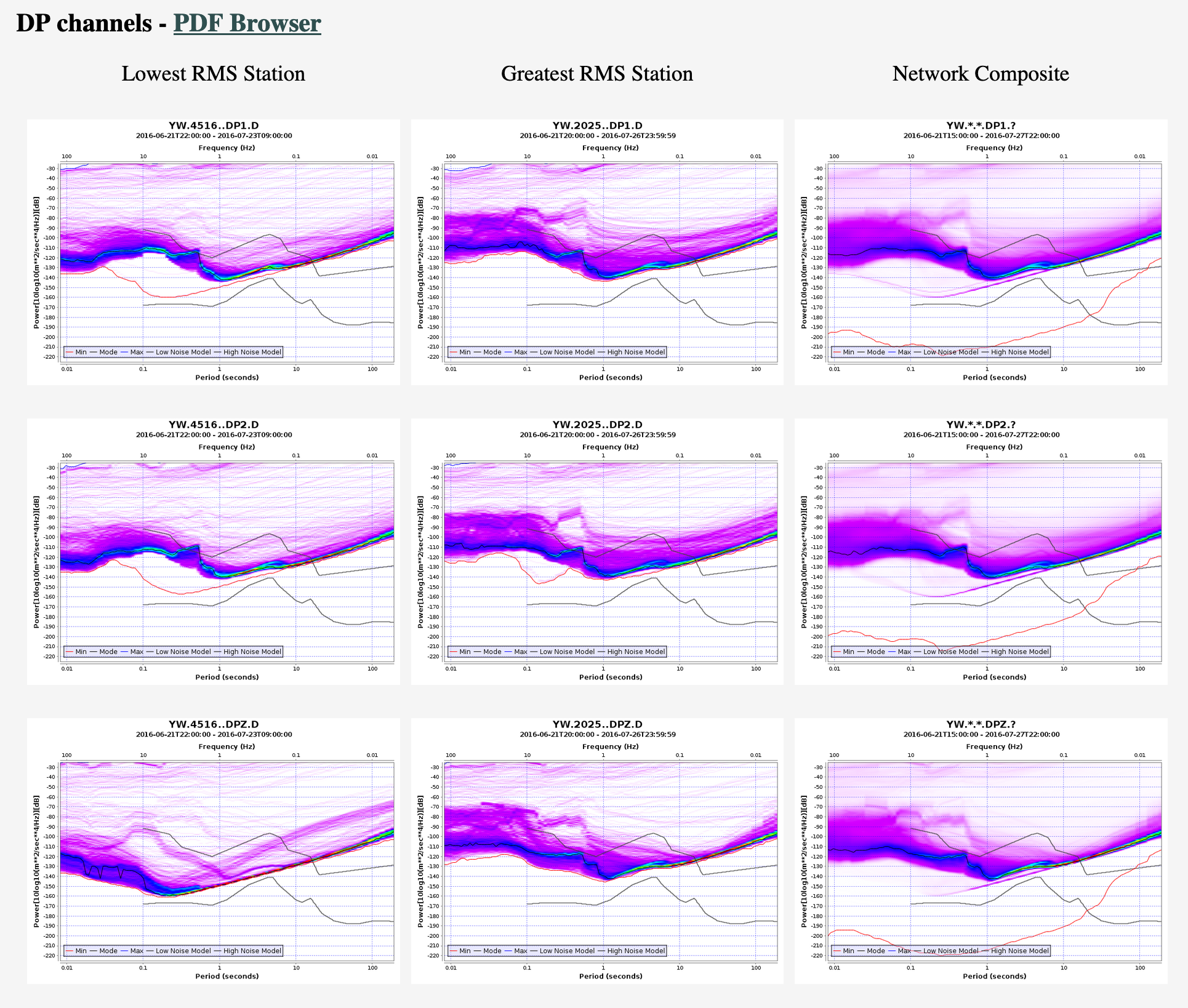
- The PDF section displays three columns of PDF plots (Figure 3). The first two columns are PDFs for the stations with the highest and lowest median sensitivity-scaled sample_rms values for vertical components, with preference for stations with at least 75% availability. The third column is a composite PDF created using Power Spectral Density (PSD) values for the displayed channel for all network stations. The plots are created using the MUSTANG noise-pdf web service. This section also contains a link to the noise-pdf-browser, which displays PDF plots for all stations in the network and is browsable through total, annual, monthly, or daily time periods.
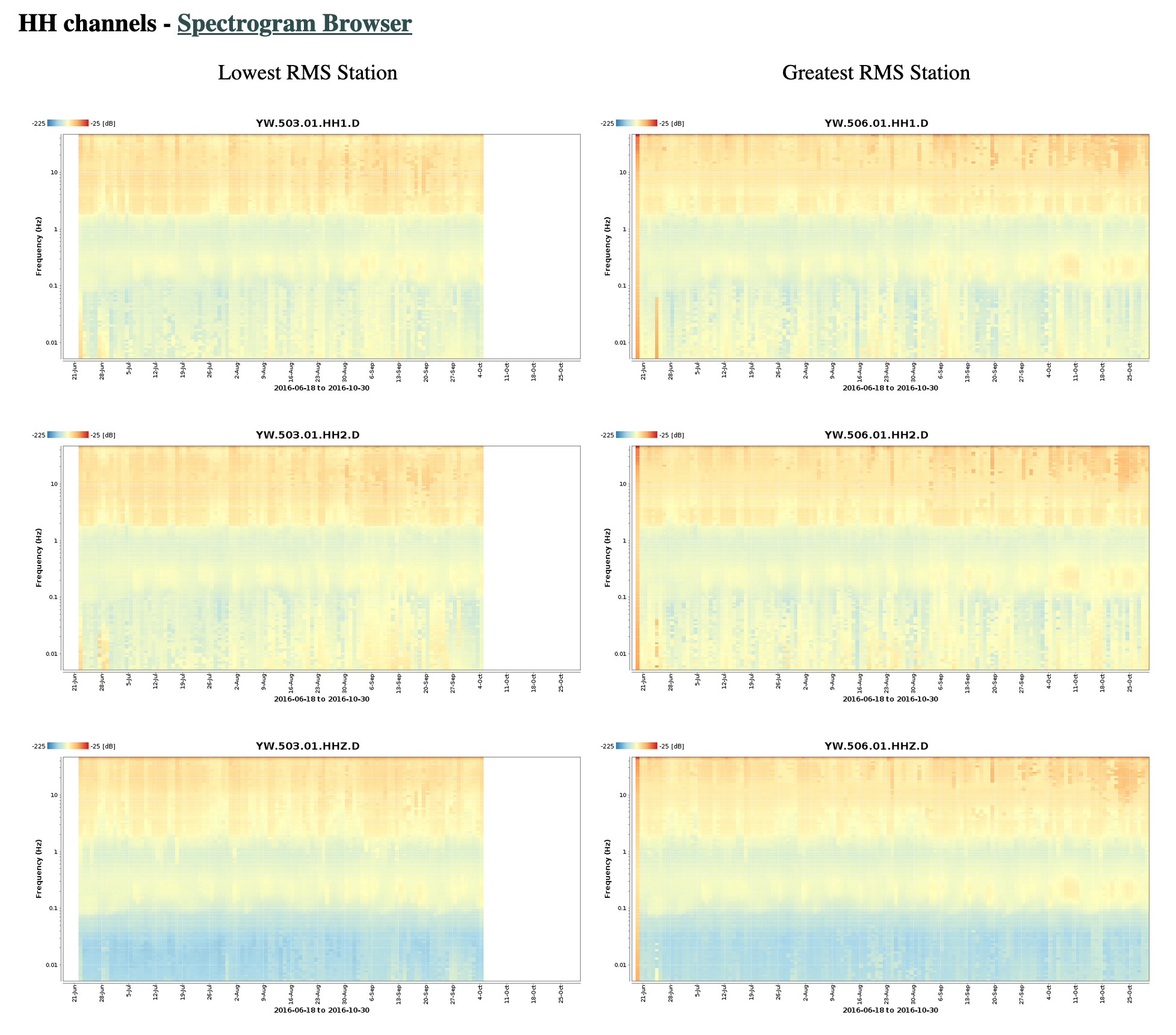
- The spectrogram section displays two columns of daily PDF-mode spectrogram plots (Figure 4). These plots prioritize availability criteria and limit station selection to the top-15 stations with greatest total availability. From these stations, the stations with the highest and lowest median sensitivity-scaled sample_rms values for vertical components are plotted, with preference for stations with at least 75% availability. The plots are created using the MUSTANG noise-spectrogram web service. This section also contains a link to the noise-pdf-browser, which displays spectrogram plots for all stations in the network.
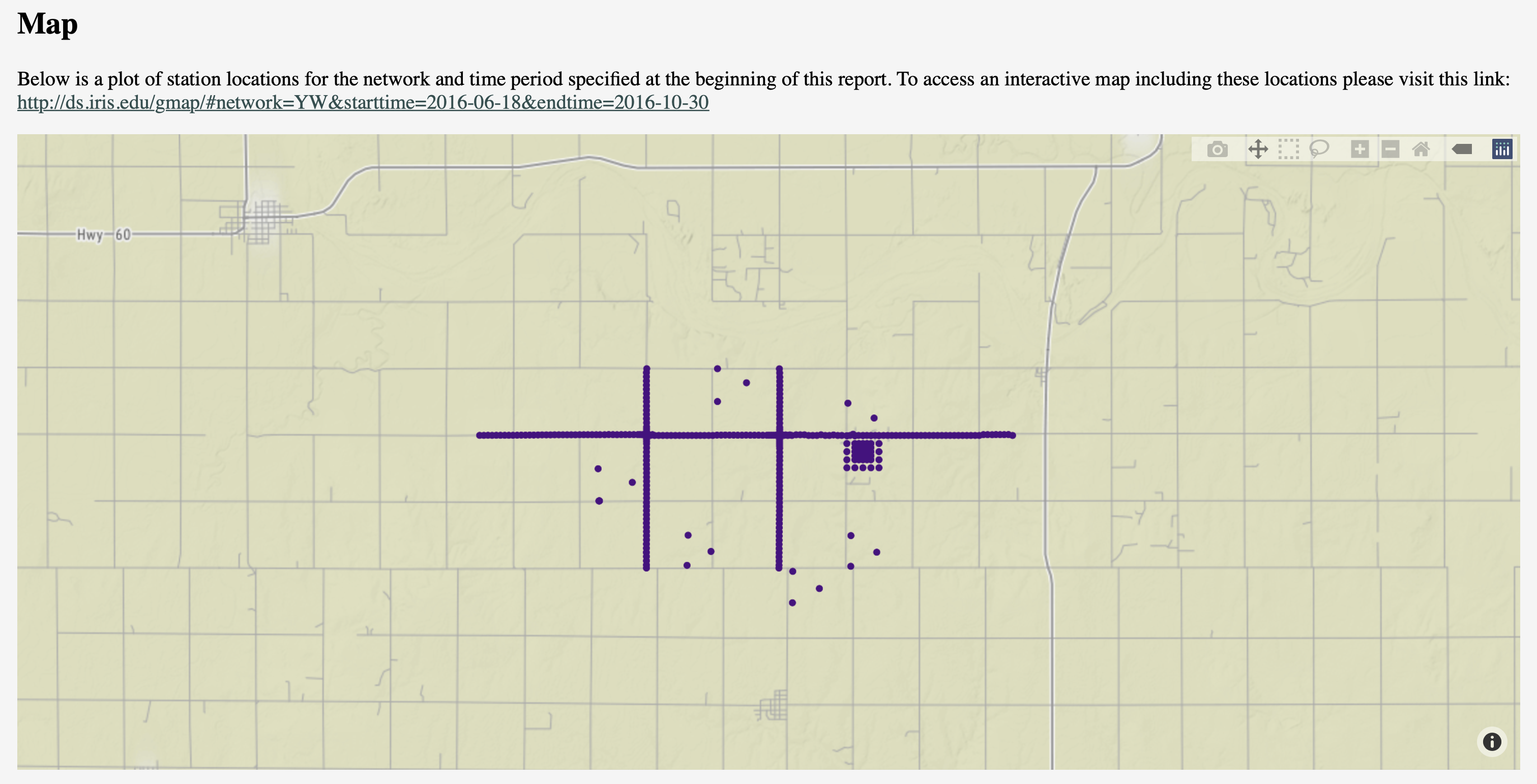
- The station map displays the locations of the network stations and a link to the IRIS GMAP tool (Figure 5).
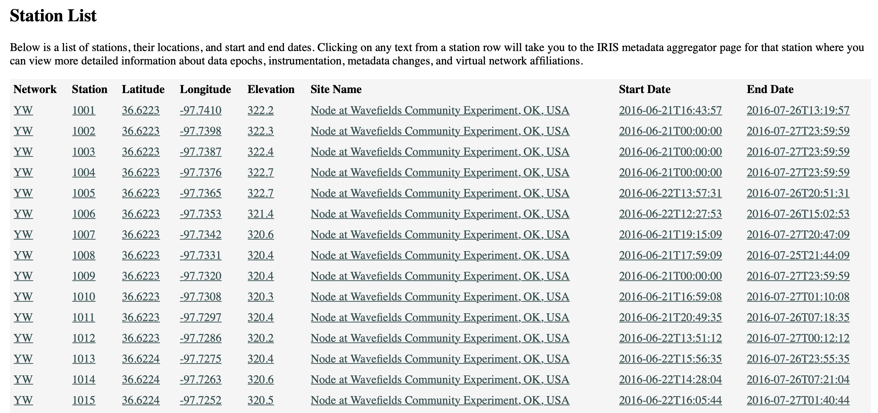
- The final section has a list of the stations, their locations, and start and end times, with links to the IRIS Metadata Aggregator to access more detailed information (Figure 6).
by Gillian Sharer (IRIS Data Management Center) , Laura Keyson (IRIS Data Management Center) and Justin Sweet (IRIS PASSCAL)


