Updated 2018-12-04 — added information about federated data access.
Newsletter 
See our demo screencast or our newsletter article for a quick overview of Wilber 3.
Browse Events 
Load Wilber 3 at http://ds.iris.edu/wilber3.
Explore the event data 
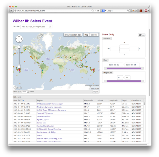
Wilber initially displays all events for the past 30 days. Note that the Date and Magnitude sliders reflect the range of this data.
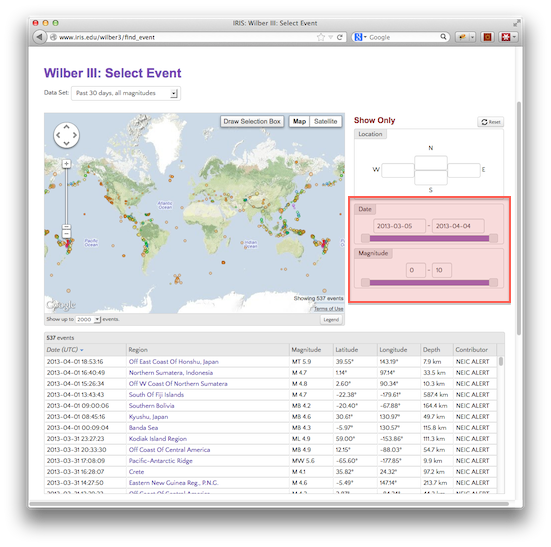
Dragging the slider handles causes both the map and the table of event data to update accordingly.
Load a different set of event data 
The last 30 days of data is useful, but larger datasets can be more interesting. Click on the Data Set dropdown and select “Past 12 months, M4.0+”.
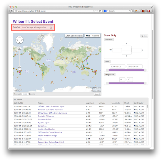
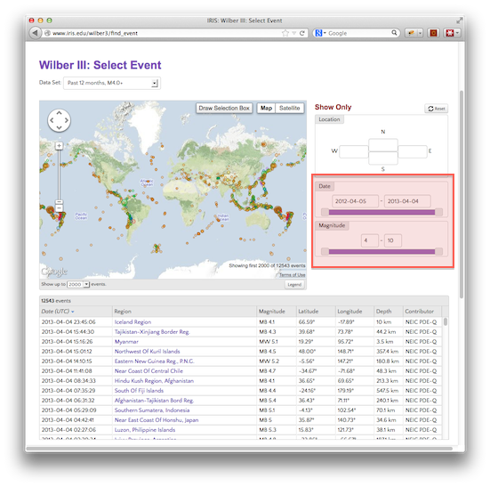
This will load all magnitude 4.0 and larger events for the last 12 months. This will return a much larger set of data, usually over 10,000 events.
Note that the slider ranges have changed to reflect the new data.
Map display limits 
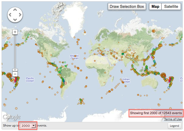
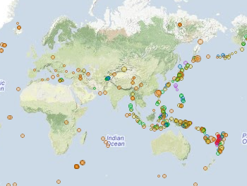
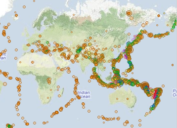
You may notice that the map is not displaying every single event. For both legibility and performance reasons, the map limits the number of points it will render. This can be changed depending on your taste and computer speed.
| 500 event limit | 5000 event limit |
|---|---|
 |
 |
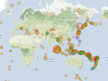
The map renders events according to the order that they are listed. Clicking on a column header in the data table will change the ordering, and thus change which events are shown.
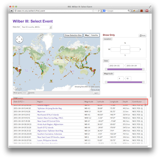
| Sort by date (500 most recent) | Sort by magnitude (500 largest) |
|---|---|
 |
 |
Map zoom and pan 
Zoom into the map by using the zoom control or double-clicking on an empty part of the map. Pan around the map by clicking and dragging. When zoomed in, the map bounds are reflected in the Location filter and updated as the map is panned, and the list of events is filtered to match.
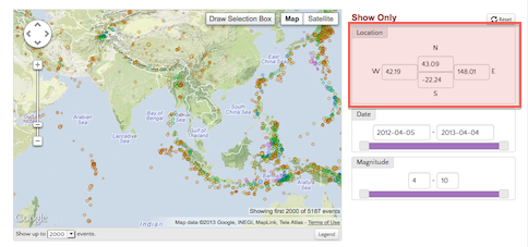
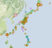
Because zooming in reduces the number of events listed, the map can look deeper into the event list before hitting its display limit. The practical effect is that zooming in shows more events.
 |
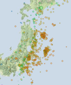 |
| When zoomed out to view the entire Pacific Rim, nearly 10,000 events are listed, so most of them are hidden. | Zooming in on just the Japanese islands reduces the list to under 1000 events, so every one can be displayed. |
Draw a selection box 
Click the Draw Selection Box button on the map, then draw a rectangle on the map. Only the points within the box will be shown. When this box is active, the Location filter is fixed and unaffected by panning the map.
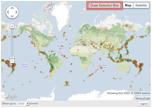 |
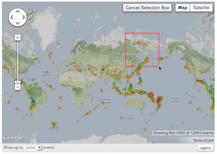 |
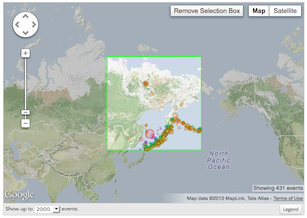 |
Highlight an event 
Clicking on an event marker displays a small box of information, and highlights the event in the data table. Events can also be highlighted by clicking on a row in the table.
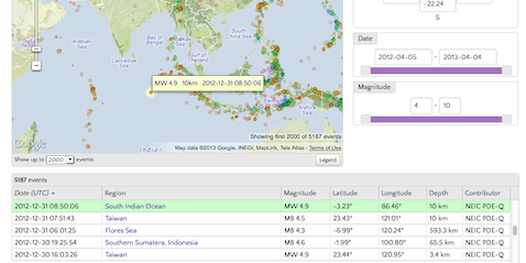
Select an event 
Both the popup box on the map and the data table contain links to the event page, which can be used to request data.
 |
 |
Stations and Data 
For a selected event, this page lists (and maps) all responding stations.
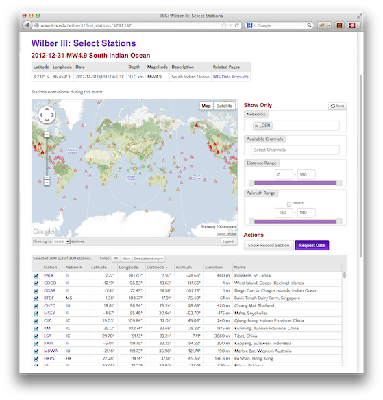
The basic structure of this page is the same as the events page — it contains a map, a set of filters, and a data table, all of which are linked to each other.
Federated Data 
Wilber can now find and download data across multiple datacenters through the irisws-fedcatalog service.
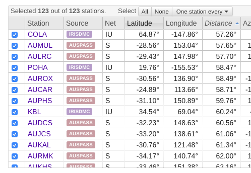
The primary datacenter for each station is listed, but apart from that the process is mostly invisible. When processing a request, Wilber will gather data from all the datacenters indicated, and deliver a single download.
See the Federator help page for more information.
Station Map 
The map is centered on the event, with station color and contour lines indicating distance from the event.
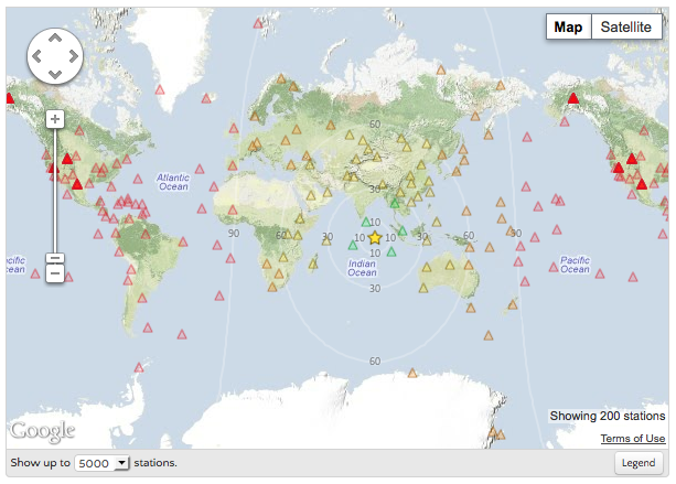
Note that unlike the events map, zooming and panning the map does not affect the listed stations.
View station details 
Click on a station, or a row in the table. It is highlighted in the same way as events on the previous page.
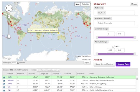
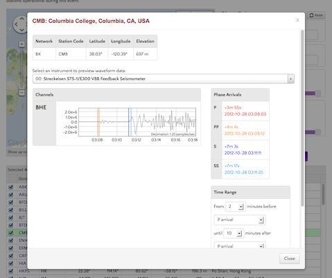
Clicking on a station link in the map popup or the data table shows station details, including sample waveform plots.
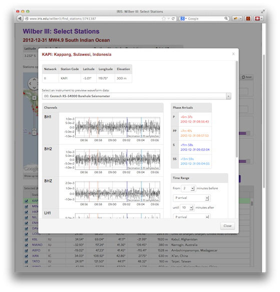
A dropdown box lists the instruments installed at the station, along with the channels for each. Selecting an instrument will show waveform plots for all of its channels.
Waveform previews 
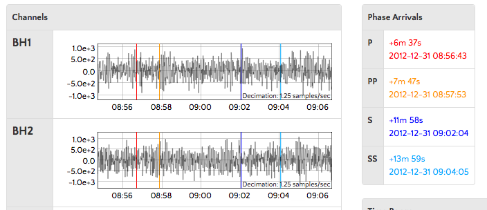
Each channel shows a plot of waveform data. Markers on the plot indicate various phase arrival times, identified by color.
Missing waveform data 
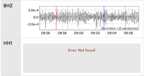
Wilber relies on various bits of metadata to determine whether data for a particular channel is available. This is occasionally inaccurate, especially for very recent events where data processing may still be in progress.
Waveform plot time window 
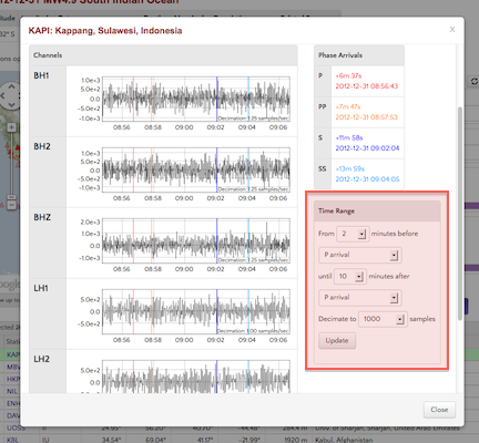
Data is plotted for a window of time based on either event time or phase arrivals. The various window parameters can be changed with the Time Range controls.
| Start | End | Plot |
|---|---|---|
| 2 minutes before P | 10 minutes after P |  |
| 5 minutes before event | 60 minutes after P |  |
Show only certain stations 
The filter controls allow only certain stations to be displayed.
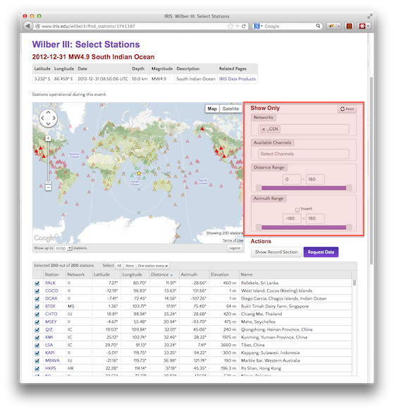
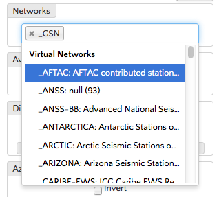
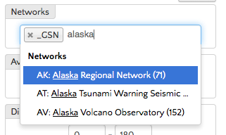
By default, the Networks filter is configured to show only stations in the _GSN virtual network. Additional networks can be added by clicking on an empty area in the control and selecting an entry. Typing will filter this list to only matching entries.
 |
 |
 |
To remove a network, click the “x” next to its name. Clearing this field entirely will show all networks.
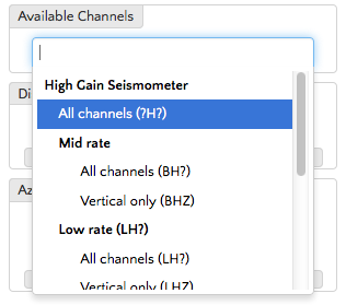
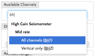
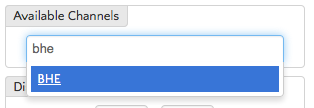
The Channels filter includes only stations with data in one of the given channels. The dropdown list here includes only certain common channels, but any channel can by typed in. This filter also supports wildcards (eg. BH?).
| Common channels listed | Typing “bh” lists only the matches in that list | But “bhe” is still valid |
 |
 |
 |
Note that the channel selection is applied everywhere — for example, if BHE is selected, then areas like the station preview will show only BHE data.
Record Section 
Wilber can also show waveform data as a record section.
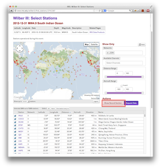
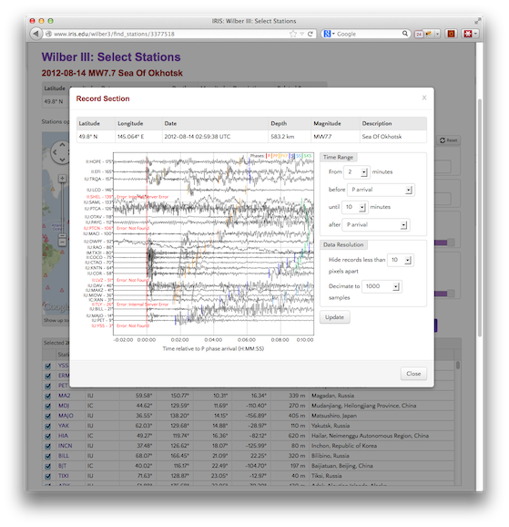
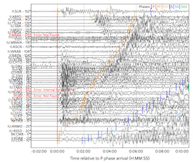
Stations are arranged by distance from the event. Phase arrivals are marked for each station.
Display controls 
The record section uses the same time window and decimation parameters as the station preview. These controls are also linked — changes made in one place will be reflected in the other.
| Start | End | Plot |
|---|---|---|
| 2 minutes before P | 10 minutes after P | 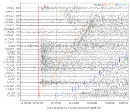 |
| 5 minutes before event | 60 minutes after P | 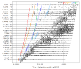 |
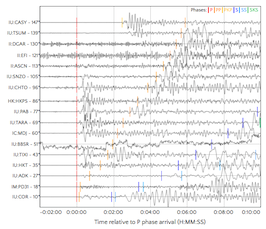
The record section also includes a minimum spacing control, which hides plots that would otherwise be drawn on top of each other.
| 20px spacing | 5px spacing |
|---|---|
 |
 |
Station Selection 
The filter controls determine which stations are available for inclusion in any data request; the actual selection of individual stations occurs on top of this.
Each listed station can be selected or deselected through a checkbox. By default, all available stations are selected.
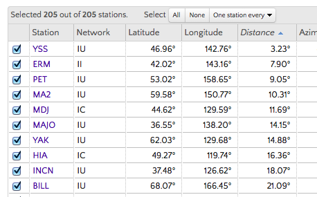
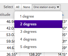
Individual stations can be selected or deselected, or a set of stations can be selected using group controls. All and None select and deselect all available stations. A dropdown option selects a distributed set of stations, one station every X degrees distant from the event.
Requesting Data 
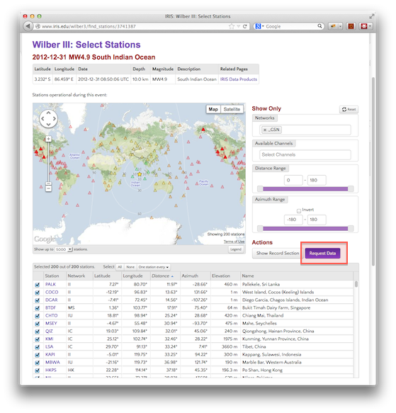
The ultimate goal of Wilber is to generate a request for downloadable data.
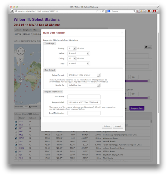
Requested Channels 
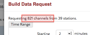
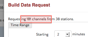
Wilber will request data for all available channels, which is often too much. The Channels filter on the main page should specify the channels to include.
| No channel filter | Channels set to BH? |
|---|---|
 |
 |
Time Range 
The settings here will reflect any changes made in the station preview or record section previews.
Data Output 
Wilber supports a variety of output formats. Depending on the format, additional options may be available; for example, if the output format generates a separate file for each channel (eg. SAC) these can be bundled into a single downloadable file.
Request Information 
Your name and an arbitrary label (default is an event description) are used to identify the request. The combination of these must be unique; you cannot submit multiple requests with the same name and label.
You may optionally receive email notifications regarding the progress of your request. Requests are queued and may not be handled immediately, especially if there are many other requests being submitted at the same time.
Monitoring a Data Request 
Once a data request has been successfully submitted, you will be given a link that can be used to track the request and (when complete) download the data. This is a permanent link, so it can be bookmarked and returned to later.
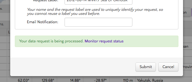
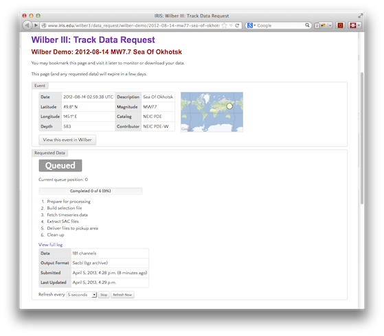
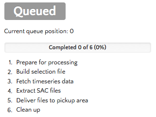
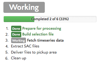
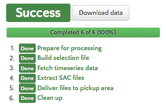
This page maintains a live view of the data request progress. The data request is first added to a queue (Queued) until the back end system is ready to process it. The request is then processed (Working) with the page indicating the progress of each step. Once the request is complete (Success) the page will provide a link to download the resulting data file(s).
 |
 |
 |
Downloading Data 
The downloadable data is placed in a public folder based on the user name and label of the request, and may be accessed via HTTP or FTP. For example:
User: Wilber Demo
Label: 2012-08-14 Mw7.7 Sea of Okhotsk
HTTP Access: http://www.iris.edu/pub/userdata/wilber/wilber-demo/2012-08-14-mw77-sea-of-okhotsk
Anonymous FTP Access: www.iris.edu/pub/userdata/wilber/wilber-demo/2012-08-14-mw77-sea-of-okhotsk
Support 
For questions or problems, contact us at data-help@earthscope.org.
Categories
Release date: Modified date:


