USArray Ground Motion Visualization
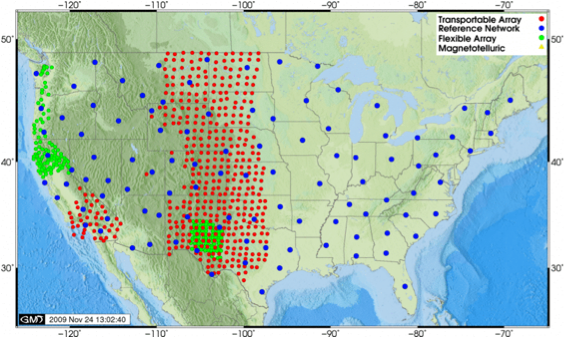
USArray (red dots) along with other USArray components.
The Transportable Array component of the USArray/EarthScope project is a rolling array of 400 broadband stations deployed on a uniform 70-km grid. This very large aperture array, along with other stations from USArray, is well suited to visualize seismic waves crossing the contiguous United States. For more information on the USArray project see http://www.usarray.org.
In this article we describe the IRIS Ground Motion Visualization product that is generated using the data collected from this dense array of broadband seismometers. These visualizations capture the temporal and spatial behavior of the ground motions as the earthquake waves move across the array.
Visualization of seismic wavefields using the USArray data was first developed by Charles Ammon and Thorne Lay in an attempt to demonstrate pedagogic and research applications of such visualizations. Their animation scheme was later adapted to MATLAB by Bob Woodward at IRIS and is used to produce Ground Motion Visualizations(GMVs) for a wide range of large earthquakes. The IRIS DMC is in the process of automating the generation of these visualizations.
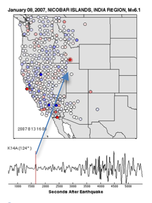
the amplitude or height of the earthquake wave. Blue represents downward ground
motion, red represents upward ground motion.
Each USArray GMV illustrates how seismic waves travel away from an earthquake by depicting the recorded wave amplitudes at each seismometer location using colored circles. The color of each circle represents the amplitude of the ground motion as detected by the station’s seismometer and it changes as waves of differing amplitude travel past the seismometer. Blue circles represent downward ground motion while the red circles represent upward ground motions with the darker colors indicating larger amplitudes. A random representative trace is displayed on the lower part of the animation with its horizontal axis representing the time (in seconds) after the event. Location of the representative station is marked on the map by a red circle (Figure 2).
Currently, the visualizations are done using data from the vertical channels with each animation starting at about 4 minutes prior to the nominal P-wave arrival-time for the “center” of the array. Animations for small events continue past the arrival time of the short-arc arrivals R1 and the large-event animations continue past the time of the longer-arc arrivals R2. Below are a few samples of GMVs available on the IRIS website.
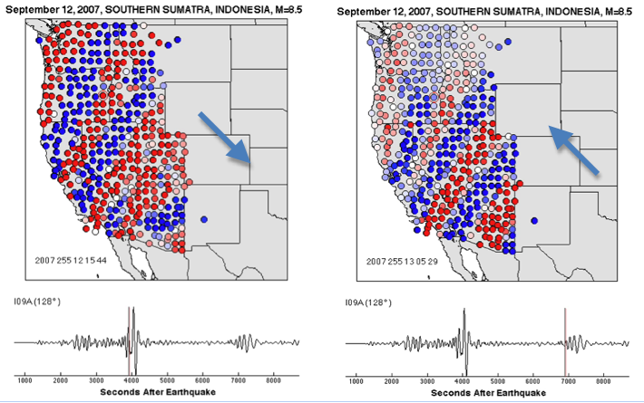
The first example (Figure 3) shows the visualization of the September 12, 2007 Southern Sumatra event of magnitude 8.5. The left panel shows the R1 arrivals that travel the shorter distance from the source to the array and panel to the right shows the R2 arrivals (traveled in the opposite direction) for the same event.
Events occurring within the USArray area produce an outward radiation pattern as shown in (Figure 4 ). This figure is based on the visualization of the February 21, 2008 Nevada earthquake of magnitude 6.0 that took place at center of the array. Seismic waves from the events in the Arctic Ocean region sweep the array from north to south as shown by visualization of the magnitude 6.1 event of February 21, 2008 in the Svalbard region (Figure 5).
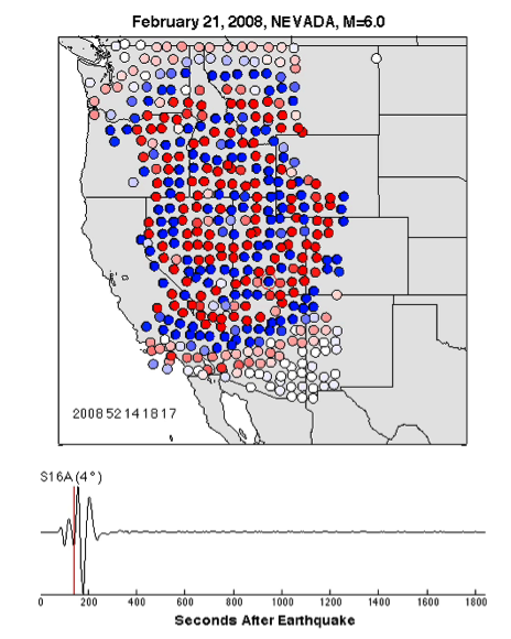
of magnitude 6.0 that took place at center of the array.
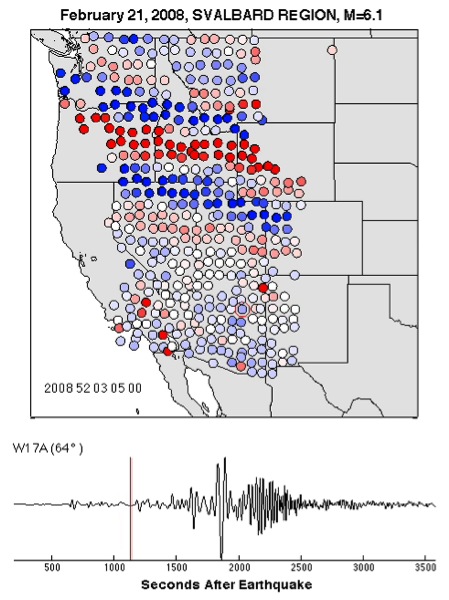
Ocean sweep the USArray in a north-south direction.
The last two examples are from the visualizations of the April 6, 2009 magnitude 6.3 earthquake of the central Italy (Figure 6, left) and the August 30, 2009 earthquake of magnitude 6.9 from Gulf of California (Figure 6, right) that show the seismic waves sweeping across the transportable USArray in the southwesterly and northeasterly directions respectively. In addition, the radiation pattern for the Gulf of California earthquake (Figure 6, right) suggests that the event occurred as a result of strike-slip faulting.
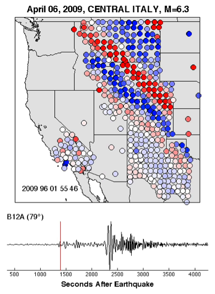
event showing a southwesterly direction of seismic energy
distribution across the USArray network.
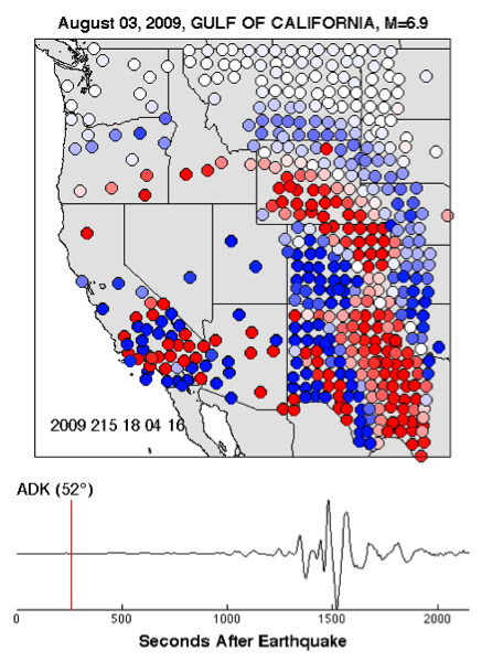
event showing a northeasterly direction of
seismic energy distribution across the USArray network.
The DMC will be producing these Ground Motion Visualizations for all moderate to large global earthquakes and special case earthquakes that occur very near or within the Transportable Array. All of the visualization movies will be available here. While the DMC will continue to incorporate enhancements into the visualizations one of the principal goals is to provide a consistent set of visualization products.
More Information
by Manoch Bahavar (IRIS Data Management Center) and Chad Trabant (IRIS DMC)


